Solovant
Interview with Jerron Smith: Design, Motion Graphics, and the Making of DeadSet
At Solovant, we like to highlight creative professionals who combine technical skill, visual thinking, and practical digital production. For this interview, we feature Jerron Smith, also known as The Pixel Smith.

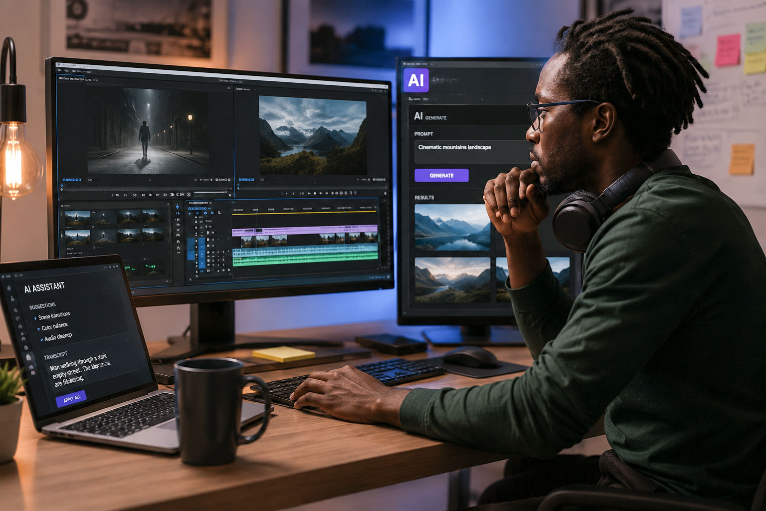
Jerron is a motion graphics and video creator, animator, editor, educator, and digital media professional from New York City. His work connects design, video, animation, storytelling, and teaching. Across his career, he has worked with tools and workflows related to motion graphics, video editing, Adobe software, and digital media education.
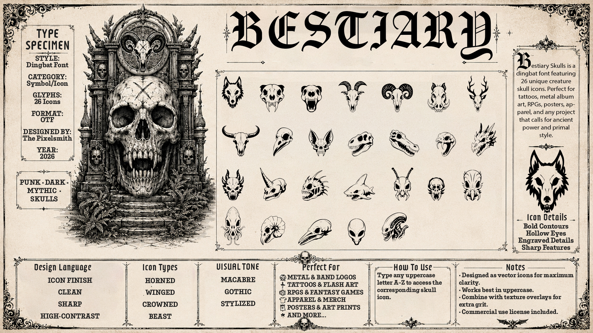
His project DeadSet is a dark, skull-inspired dingbat font. Instead of regular letters, the font presents a set of visual glyphs that can be used as graphic elements. DeadSet is designed for posters, merch, motion graphics, and other dark visual design projects. It is also presented as a pay-what-you-want digital product, which makes it accessible for designers, students, and creative professionals who want to experiment with it.
The Interview
1. How would you personally describe your creative identity today?
These days, I like to describe myself as a designer, animator and educator. I like to create art and design of course but it really excites me to see and create interesting motion work. There’s something about watching a work move that adds extra layers to the messaging. I have always been interested in giving back by teaching others especially when it comes to design and creativity.
2. What inspired the idea behind the DeadSet font?
So there are actually two related fonts Deadset and Bestiatry. I think I was working on a punk-rock zine inspired piece of concept work and was looking at a lot of grungy, brutalist, rough work. Stuff with a lot of texture and personality. I saw a couple of stenciled skull art and thought it might be cool to create a font. I have been on a kick of creating and building my own fonts in the last couple of months and these two are the latest entries.
3. Why did you decide to create DeadSet as a dingbat font instead of an illustration or icon pack?
So that’s the million dollar question isn’t it. I like fonts mostly because I feel font files are very flexible. In every design program I know they give you all the strengths of an icon set and a bunch of added bonuses. For example, I use Adobe After Effects a lot, and with a font I can use all of the text animation features along with anything I could do to any other layer type. A lot of times if you see something I’ve made that looks like shape animation it’s probably text animation instead. I’ve made a bunch of dingbat fonts that are intended to be used as the base elements in building animations.
The one major weakness is that in most programs fonts are monochromatic but since the style I wanted to use was black and white only it wasn’t a hindrance in this case.
4. Were there specific project types, audiences, or visual cultures that influenced the dark, skull-based direction?
You can’t tell from my corporate headshot, but I have an eyebrow ring, three holes in each ear and a bunch of tattoos. And if you meet me in real life, I’m also as likely to have purple hair as my own salt and pepper. And I tend to dress like a skater punk who never grew up in baggy jeans and graphic tees (often with custom distressing, stenciling or bleach staining I do myself). I once had a colleague who recommended me for a horror themed gig because as she said, “you’re pretty dark and morbid”, (thanks Jennifer). I’m not really dark or morbid but I do like that aesthetic.
5. How did you approach the design of the 26 glyphs? Did you follow a system, or was the process more intuitive?
I have a system and this is the part that may get me a lot of hate but it involves generative AI. So GenAI is where I do my concepting and ideation. I start off in ChatGPT where I research styles and ideas for fonts. I then work and refine the visual appearance of the glyphs in the font through multiple rounds of revisions. I then generate a font specimen sheet as reference. For the more organic or drawn fonts I bring the reference into Adobe Fresco and use a vector brush to draw the glyphs. I then export the Fresco file to Adobe Illustrator and clean up the glyphs. Then I use an add-on Font Self Maker to create an OTF font. If the font is more geometric in nature I create the glyphs directly in Illustrator and the rest of the process is the same.
6. What tools or workflow did you use to move from concept to finished font?
So in total I use ChatGPT for concepting and mockup, Adobe Fresco and Illustrator for glyph creation and FontSelf maker for font file creation.
7. When creating the glyphs, did you imagine how they might move on screen?
For the Deadset and Bestiary fonts I was not considering how they might be animated. The geometric fonts I’ve made are created to be modular elements that can be used to create more complex graphics and animation.
8. How could a designer or motion artist use DeadSet in a real project?
Deadset and Bestiary are intended as icon fonts where each character is an individual graphic. Designers and motion artists could use Deadset and Bestiary as fast, flexible visual asset systems rather than treating them only as novelty fonts. Because each skull is accessed by typing a letter, they can function like a library of scalable vector icons inside Illustrator, Photoshop, InDesign, After Effects, Premiere, Resolve/Fusion, or any font-friendly workflow.Deadset would be stronger for general macabre merchandise: skull badges, gothic slogans, horror-themed shirts, and dark design motifs. Bestiary would be stronger for designs that need creature energy: beast skull emblems, monster-hunter graphics, dark fantasy clans, fictional factions, or RPG-inspired apparel.
9. How does teaching influence your creative process?
Teaching influences my creative process by making me more intentional, reflective, and audience-centered. When I teach, I have to break complex creative decisions into clear steps: why a composition works, how motion supports meaning, why a tool choice matters, or how a visual system communicates to a specific audience. That habit carries directly into my own work. I do not just make design choices instinctively; I examine them, articulate them, and refine them with purpose.
It also keeps my practice active and exploratory. Students often approach problems from unexpected angles, ask questions I might not have considered, or use tools in ways that challenge my assumptions. That exchange keeps me curious and pushes me to keep experimenting rather than relying on familiar solutions.
Most importantly, teaching reminds me that creativity is not just self-expression; it is communication. Whether I am designing, animating, editing, or developing a learning experience, I am always thinking about clarity, engagement, structure, and impact. In that way, teaching has made my creative process more disciplined, more adaptable, and more connected to the needs of an audience.
10. What specific lessons would you want students to take from the DeadSet project?
One of the strongest lessons is that a font does not have to be limited to alphabetic type. Deadset and Bestiary are dingbat/icon fonts, meaning the alphabet becomes an access system for visual assets. Students can learn that typography can operate as: a typeface, an icon library, a pattern generator, or a branding toolkit. The practical lesson is that a font can be designed as a reusable system of symbols. Each key on the keyboard becomes a way to deploy a visual idea quickly.
Additionally, the idea that constraints make the work stronger. Both fonts are built around clear constraints: 26 icons, A–Z mapping, black-and-white artwork, strong silhouettes, gothic/macabre tone, and font usability. Those restrictions give the work coherence.
11. How do you see AI fitting into the creative process?
AI is unusual in that it can function as both a tool and a service. It is important for creatives to use it as a tool. And as a tool, AI fits into the creative process as an ideation and design-development partner, not as the final maker of the font. ChatGPT helped generate and refine the initial concept, clarify the audience, establish the visual direction, brainstorm names, define use cases, and shape the product language around both Deadset and Bestiary. In that sense, AI supported the early stages of the design process: research-like exploration, concept expansion, naming, positioning, and creative brief development. It helped turn a loose idea — a skull-based icon font — into a more structured design system with a clearer mood, audience, and product identity.
The actual font artwork, however, was still created through a hands-on design workflow: drawing the graphics in Adobe Fresco, refining them in Illustrator, and making the final visual decisions as the designer. AI accelerated the front-end thinking and gave the project a broader range of possibilities to evaluate, but the authorship remained rooted in human judgment, drawing, editing, and production craft. The process is a useful example of AI as a collaborative tool: it can help generate directions, language, and frameworks, while the designer remains responsible for selection, refinement, execution, and the final creative voice.
12. Which skills do you think are most important for designers right now, even as tools become more automated?
As AI and creative tools become more automated, the most important design skills are the ones that sit above tool operation: judgment, creative direction, visual literacy, and problem framing. Software can generate options, remove backgrounds, suggest layouts, animate assets, and produce polished-looking variations, but it cannot reliably decide what is appropriate for a specific audience, message, brand, or cultural context. Designers still need to understand composition, hierarchy, typography, color, pacing, contrast, rhythm, and meaning. For motion artists, this also includes timing, staging, continuity, camera logic, and emotional pacing. These fundamentals matter even more now because AI can easily produce work that looks impressive at first glance but still has weak structure, unclear communication, poor readability, or inconsistent style.
Designers also need strong iteration, critique, communication, and production skills. AI can create volume, but designers must select, refine, reject, combine, and improve the results with intention. Prompting is becoming important, but the real skill is being able to write a clear creative brief: defining the subject, mood, style, audience, constraints, and intended use. Finally, automation does not remove the need for production literacy. Real projects still require vector cleanup, file preparation, accessibility, licensing awareness, export settings, animation rendering, and platform-specific delivery. The most valuable designers will not simply be the ones who know the newest tools; they will be the ones who can combine conceptual thinking, visual judgment, technical craft, and ethical decision-making into work that is purposeful and usable.
13. What advice would you give to creatives who have ideas for small digital products but have not published them yet?
My advice to creatives with small or big digital product ideas is simple: publish the first version before you feel completely ready. I did not publish my first font until I was 50, and that experience reminded me that there is no official timeline for making or sharing creative work. Some of the most interesting creative careers have started, restarted, or found momentum later in life. Grandma Moses began painting seriously in her later years, Vera Wang entered bridal design after earlier careers in figure skating and fashion editing, and many writers, artists, designers, and performers have found their audience well after the age when people assume you are “supposed” to have everything figured out.
Small digital products are especially good places to begin because they do not have to be massive, perfect, or definitive. A brush pack, icon font, template, texture set, zine, preset, workbook, or small design tool can be a focused experiment. The important thing is to finish something, package it clearly, explain who it is for, and put it somewhere people can actually find it. Publishing teaches lessons that private files never can: what people respond to, what they misunderstand, what they value, and what you might want to make next.
I also think Sir Ken Robinson’s idea of finding your “tribe” is very relevant here. Your audience cannot gather around work that stays hidden on your hard drive. If you do not put yourself and your work out there, you make it much harder for the right people to recognize what you are doing, connect with it, use it, and encourage you to keep going. The first product does not need to define your entire creative identity; it just needs to open the door. Publish the thing, learn from the response, and let the next one be better.
14. Where can people find your work and download DeadSet?
The best place to see my work at the moment is my behance site: https://www.behance.net/thepixelsmith
You can download Deadset and Bestiary on gumroad: https://thepixelsmith.gumroad.com/
Its pay what you want, so zero is fine with me. I just wanted to create something to give back to the community that has been so helpful to me.
I’m also on Instagram (@thepixelsmith) and Linkedin (Jerron Smith)
If you would like to learn more from Jerron, he teaches creative technology and digital media classes at Solovant. Through his classes, students can develop practical skills in design, motion graphics, video, and professional creative workflows while learning directly from an experienced educator and industry professional.